エピソード

  • INTRODUCING Re(un)Covered Podcast: Season 1
    2023/11/29

    Join Bethany, a literary researcher with a passion for the obscure, as she shares recovered and uncovered stories from archives around the world.

    For season one, we'll be talking all about the (mostly) forgotten women of the metal type era, a time when Monotype and Linotype technologies changed printing forever. From designing fonts to Leipzig's 1914 Internationale Ausstellung für Buchgewerbe und Graphik, typography histories to disinformation campaigns, we'll look at women designing typefaces from the late 1800s to 1950s around the world. Come for the archives, stay for the stories. This is archival recovery, out loud.

    Credits
    Creator and producer: Bethany Qualls
    Editor: Joe DeGrand

    Music
    "Despair Metal Trailer" by LiteSaturation
    "Sneaky Feet" by geoffharvey

    Support the show

    Credits
    Creator and Producer: Bethany Qualls
    Editor: Joe DeGrand
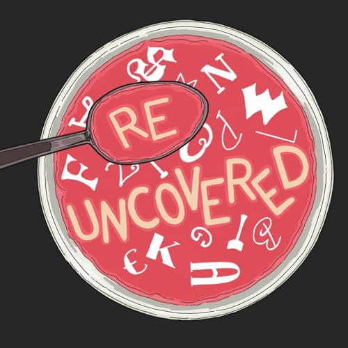
    Original episode artwork: Trifoxatops aka Jenna Mauro
    Social Media Whisperer: Elizabeth Giardina
    Music: "Sneaky Feet" by geoffharvey

    Like what you hear? Keep listening! Subscribe to Re(un)Covered wherever you get your podcasts.

    Want to chat? Follow us on Instagram or send us an email.

    続きを読む 一部表示
    2 分
  • Just What Is Re(un)Covered?
    2025/10/05

    “Why did you rub the lamp that contains me?” 🧞

    Joe and Bethany cover what you’ll be hearing on Re(un)Covered, what is archival recovery, some feminist history, and how knowing a more inclusive past can help us make a better future. Also: dinosaurs 🦖🦕🐓.

    Season 1 of Re(un)Covered talks about women who designed typefaces in the hot metal type era (late 1800s to 1950s). For each episode Bethany and Joe will talk about what we know (and don’t know) about one or two of these women type designers, then Bethany will chat with a special guest about the designer and/or the episode’s broader theme. If you want to see hot metal type in action, Monotype and Linotype technologies are good places to start.

    PSA: everything important has not been digitized. Don't be fooled.

    References (we love citing sources here) 📚

    Foundational research on women metal type designers:

    • Club of Printing Women of New York, Antique, Modern & Swash: A Brief History of Women in Printing (1955)
    • Laura Webber, "Women Typeface Designers" (MA thesis, RIT, 1997)
    • Gerda Breuer and Julia Meer, eds, Women in Graphic Design 1890-2012 (Jovis, 2012)
    • Alphabettes, “Women in Type Bibliography” (2020)
    • Yulia Popova, How many female type designers do you know? I know many and talked to some! (Onomatopee, 2020)
    • Fiona Ross, Alice Savoie, and Dr. Helena Lekka, Women in Type (2018–2021)
    • Lauren Elle DeGaine, "A Woman’s Type: Early Women Type Designers in 20th-Century Book History," (MA thesis, University of Victoria (B.C.), 2021)

    Also props to these folks for their ideas about how history works, archival gaps:

    • For critical fabulation as a concept, see Saidiya Hartman, “Venus in Two Acts.” Small Axe 12, no. 2 (2008): 1–14.
    • Jenny Sharpe, Ghosts of Slavery: A Literary Archaeology of Black Women’s Lives (University of Minnesota Press, 2003) and Immaterial Archives: An African Diaspora Poetics of Loss (Northwestern, 2020)
    • Ian Baucom, Specters of the Atlantic: Finance Capital, Slavery, and the Philosophy of History (Duke University Press, 2005)

    Episode credits
    Creator and Producer: Bethany Qualls
    Editor: Joe DeGrand
    Original episode artwork: Trifoxatops aka Jenna Mauro
    Social Media Whisperer: Elizabeth Giardina
    Music: "Sneaky Feet" by geoffharvey

    Support the show

    Like what you hear? Keep listening! Subscribe to Re(un)Covered wherever you get your podcasts.

    Want to chat? Follow us on Instagram or send us an email.

    続きを読む 一部表示
    12 分
  • The Unanxious Influencer
    2025/10/05

    “History: problematic and cool, all at once” 📜✒️🗃️

    Anna Simons (1871–1951) taught hand lettering to a generation of designers. She studied calligraphy with Edward Johnston at Royal College of Art (UK), then taught courses in his place in Germany and translated his work into German. After WWI Simons went on to teach how to use broad nib pens across Europe for decades. She also designed some 1400 titles and initials for Bremer Press.🖋️

    Simons was part of the BUGRA (Weltaustellung für BUchgewerbe und GRAfik; the International Exhibition for the Book Trade and Graphic Design) in May 1914 in Das Haus der Frau (The House of Women) pavilion. She was listed as a Schriftkünstlerin (type artist) but did not design typefaces. The bombing of Munich in 1944 destroyed her home and the Bremer Press building. She won many awards, influenced many designers, and died in 1951.

    Since we’re talking about typography and design this season, this episode also helps everyone get on the same page about what type design includes, some key terms (letterforms, typefaces, typography, type design, typographer, fonts...), and where the metal type era fits into the bigger history of design. Nina and Bethany even talk about Comic Sans (“not that horrible“), why design is never neutral, and the “inspiration soup” that’s all around us. Plus how type design’s history of self-mythologizing influences what we know today.

    Special guest: Nina Stössinger, type designer at Frere-Jones Type, teacher at Yale School of Art, fan of Nicolas Jenson’s Roman typeface

    PSA: How often do you think about the Roman empire?

    References 📚 Samples of Anna Simons’s work (mostly in German):

    • with Peter Behrens, Dem Deutschen Volke ("To the German People") on the German Reichstag building, Berlin (1916)
    • Bremer Press lettering work: Titel und Initialen für die Bremer Presse, Bremer Presse, 1926 (images via UW-Milwaukee Special Collections)
    • “Der Staatliche Schriftkurs in Neubabelsberg,” Kunstgewerbeblatt, March 1910, pp. 101–7 (Simons’s students work on pp. 108-13)
    • Want more? Search for Anna Simons in Gebrauchsgraphik and other period trade publications via the International Advertising & Design Database.
    • See also German Designers, Luc Devroye, and A Short Introduction to Graphic Design History

    Credits

    Support the show

    Credits
    Creator and Producer: Bethany Qualls
    Editor: Joe DeGrand
    Original episode artwork: Trifoxatops aka Jenna Mauro
    Social Media Whisperer: Elizabeth Giardina
    Music: "Sneaky Feet" by geoffharvey

    Like what you hear? Keep listening! Subscribe to Re(un)Covered wherever you get your podcasts.

    Want to chat? Follow us on Instagram or send us an email.

    続きを読む 一部表示
    42 分
  • Who Are All These German Women?
    2025/10/14

    “I have too many tabs open” 📑 🗂️

    Today we talk about some women whose archival trace is almost ghostly in its faintness. Sometimes we only have a single date and some work products, leaving huge gaps in both their professional and personal lives. Hildegard Henning (1888–?) and Lina Burger (1856–?) are two of the first women we know designed a typeface in this metal type era. What else did they do? And why were so many of the women designing foundry type from Germany?

    We don’t know much about Henning (Belladonna, 1914, Klinkhardt) and Burger (ornamental fonts, c. 1900, Schelter & Giesecke). Both showed at the Leipzig International Exhibition for the Book Trade and Graphic Design, aka BUGRA (Weltaustellung für BUchgewerbe und GRAfik). It opened in May 1914 (map), with Das Haus der Frau (The House of Women), see more about the BUGRA here and here. Sadly, most of what BUGRA’s organizers kept was destroyed in the 1943 bombing of Leipzig.

    Dan takes us through the German type context of the early 20th century, why the BUGRA 🎡 mattered, how technology shifted design processes, and what happens when you re-read resources with fresh eyes.

    Special guest: Dan Reynolds, type history researcher, teacher at the Johannes Gutenberg University in Mainz, Germany, TypeOff writer

    PSA: Lina Burger did a commission for Otto von Bismark, but it is not trending on TikTok. Yet.

    📚

    Indra Kupferschmid, “First/early female typeface designers,” Alphabettes (2017)

    Friedrich Bauer, Chronik der Schriftgießereien (1914, 1928); pdf in German

    Dan Reynolds, “Hildegard Henning’s Belladonna typeface (1912),” TypeOff

    Belladonna via Fonts In Use and Luc Devroye

    Lina Burger’s 1901 Archiv für Buchgewerbe profile; see bookplates here & here

    Support the show

    Credits
    Creator and Producer: Bethany Qualls
    Editor: Joe DeGrand
    Original episode artwork: Trifoxatops aka Jenna Mauro
    Social Media Whisperer: Elizabeth Giardina
    Music: "Sneaky Feet" by geoffharvey

    Like what you hear? Keep listening! Subscribe to Re(un)Covered wherever you get your podcasts.

    Want to chat? Follow us on Instagram or send us an email.

    続きを読む 一部表示
    36 分
  • The Many Lives of Elizabeth Friedlander
    2025/10/30

    “Well, I want the Christmas card” 🎄🎅✉️

    Elizabeth Friedlander (1903–1984) made a typeface, disinformation campaigns, Die Dame fashion magazine layouts, decorative paper patterns for Curwen, book covers for publishers like Penguin and Mills & Boon, plus played the violin.

    Born in Germany, she studied with typography and calligraphy with Emil Rudolf Weiss (former student of Anna Simons) who likely introduced her to Bauer foundry director Georg Hartmann. Bauer commissioned her eponymous typeface Elizabeth in 1927; it was released in 1937.

    Friedlander worked as graphic designer, moving twice when anti-Semitic laws made legally working in Germany, then Italy, impossible. Sponsored as a domestic servant in 1939, she went to London. She met Francis Meynell and worked for England’s “black propaganda” unit, forging documents against the Nazis. She stayed in the UK after WWII, then moved Ireland in the 1960s.

    Graham published an incredible book about Friedlander “full of things.” Besides Friedlander, we cover how letterpress printing works, freelancer life, and where curiosity about paper leads.

    Special guest: Graham Moss, printer at Incline Press (Oldham, England), publisher of Paucker’s New Borders, fan of Manchester's history and his press in action.

    In 2025, Graham and Helen Moss moved to Scotland, planning to make a letterpress workshop with teaching and gallery space. Follow a traditional private press’s new iteration via Awen Press.

    PSA: Support the endangered craft of letterpress printing and small presses.

    📚

    • Pauline Paucker, New Borders: The Working Life of Elizabeth Friedlander (Incline Press, 1998). Curwen papers start pg.85
    • María Ramos, Review of New Borders, Alphabettes (2022)
    • Elizabeth Friedlander Collection, University College Cork, Ireland
    • Billie Muraben, “Elizabeth Friedlander: one of the first women to design a typeface,” It’s Nice That (2018)
    • Katharine Meynell, “Elizabeth” (film, 2018)
    • Elizabeth type: Fonts in Use, Klingspor
    • Swamp Press, Friedlander initials

    Support the show

    Credits
    Creator and Producer: Bethany Qualls
    Editor: Joe DeGrand
    Original episode artwork: Trifoxatops aka Jenna Mauro
    Social Media Whisperer: Elizabeth Giardina
    Music: "Sneaky Feet" by geoffharvey

    Like what you hear? Keep listening! Subscribe to Re(un)Covered wherever you get your podcasts.

    Want to chat? Follow us on Instagram or send us an email.

    続きを読む 一部表示
    54 分
  • Type In The Mid-Century USA
    2025/11/12

    “Archival recovery: it’s journalism, but with dead people” 😵☠️🪦🗃️

    Elizabeth Colwell (1881–1961) was the only woman listed as an American designer by American Institute of Graphic Arts (AIGA) in 1948. A working artist in Chicago, she was a printmaker, painter, and writer, plus designed Colwell Handletter and Colwell Handletter Italics for American Type Founders in 1916.

    Colwell wrote about hand lettering ✍️ for Sketch Book (1904). Her work also appeared The Printing Art (1905) and Inland Printer’s Lettering for Printers & Designers (1906). W.A. Dwiggins commissioned her for issues of Happyland (1914). Colwell was the first woman featured in a profile series focused on designers and illustrators by The Graphic Arts (March 1913), which includes examples of her fine arts and advertising work. She worked for the WPA’s Federal Art Project (1937) and showed at a related Art Institute of Chicago exhibition. The Library of Congress mounted an exhibition of her work in 1945. Then she dropped off the map.

    Lauren found out that Colwell did not die in 1954—she just moved out of Chicago, and died in 1961. Besides Lauren’s insights into Colwell’s art, we discuss archival rabbit holes, some favorite capital letters, and exceptionalism narratives.

    Special guest: Lauren Elle DeGaine, policy analyst, craft enthusiast, writer of the very comprehensive "A Woman’s Type: Early Women Type Designers in 20th-Century Book History" (MA thesis, University of Victoria (B.C.), 2021), chronically offline

    PSA: Patriarchy hurts us all

    📚 by Colwell

    • “Notes on Hand-Lettering,” Sketch Book (4 parts; Sept–Dec 1904)
    • Songs of Tristram & Ysevlt (1907)
    • Songs & Sonnets (1909)
    • Colwell Handletter: Luc Devroye, Fonts in Use
    • See also: AIGA’s ”American Type Designers and Their Work” exhibition (1947); Alex Jay, "Creator: Elizabeth Colwell," Tenth Letter of the Alphabet (2016); Lauren’s thesis pgs 10–25

    Support the show

    Credits
    Creator and Producer: Bethany Qualls
    Editor: Joe DeGrand
    Original episode artwork: Trifoxatops aka Jenna Mauro
    Social Media Whisperer: Elizabeth Giardina
    Music: "Sneaky Feet" by geoffharvey

    Like what you hear? Keep listening! Subscribe to Re(un)Covered wherever you get your podcasts.

    Want to chat? Follow us on Instagram or send us an email.

    続きを読む 一部表示
    40 分