

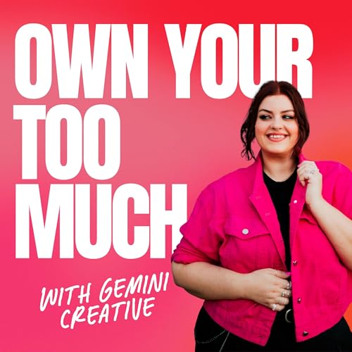
87: Anti-Beige Branding Isn't an Aesthetic. It's a Revenue Strategy.
カートのアイテムが多すぎます
カートに追加できませんでした。
ウィッシュリストに追加できませんでした。
ほしい物リストの削除に失敗しました。
ポッドキャストのフォローに失敗しました
ポッドキャストのフォロー解除に失敗しました

87: Anti-Beige Branding Isn't an Aesthetic. It's a Revenue Strategy.
-
ナレーター:
-
著者:
You think anti‑beige branding is about using hot pink instead of beige? Cute. But you're missing the point.
In this episode, I'm getting real about why "bold" isn't just a vibe – it's a business strategy. I'll show you how the right visual identity directly impacts your pricing, your client attraction, and your bottom line. Plus the specific ways beige is silently killing your revenue (and what to do about it).
Yes, we'll talk about colour. But more importantly, we'll talk about cash.
Topics covered:
Why "pretty" without positioning is just decoration
The 0.5‑second revenue test (and why you're probably failing it)
How premium brands use bold to justify premium prices
Real numbers: what happened when my clients went from beige to bold
Listen now. 💰
You can find more about Gemini Creative
On Instagram: https://www.instagram.com/its.geminiloren
Website: www.geminicreativestudio.com.au
Join the Own Too Much Challenge: https://geminicreativestudio.com.au/challenge
Want to be on podcast? We're looking for guests! Apply here: https://forms.gle/yprWQyzAiXGtwoZj6
DROP SOME LOVE ON SPOTIFY AND APPLE PODCASTS:
If you enjoyed this episode, go ahead and hit SUBSCRIBE. There is a new episode every Wednesday. Click here to subscribe on Spotify and Click here to subscribe on Apple Podcasts. AND if you are feeling extra generous, take a few seconds to leave OYTM Podcast a review on Apple Podcasts. Or post a screenshot on your Stories with some feedback. Hearing what you think about this episode and the podcast as a whole means the WORLD to me. After all, this is all for you. More reviews = more listeners = better guests & content. So all you gotta do is click here to review, click “Ratings and Reviews” and “Write a Review.” I’ll love you forever!